IndieWebCamp keeps inspiring me. Having had so much interesting conversations with interesting people that care about similar things, motivates me to work on my own homepage, blog and other web projects.
And so I’m currently still excited about IndieWeb stuff and am researching potential tools, hosting options and workflows for my personal sites.
And I’m still fancying going static with my blog, too. Most of my other projects are static already. It’s either indeed a plain hand-written static site, or generated via Jekyll, my SSG of choice (so far).
While researching, I found the following (somewhat random) articles and resources interesting and helpful so far.
I think as a first step, I might neglect the “hosting” part of my upcoming solutions a little bit. I want the hosting and deployment to be as simple as possible. And so I might sacrifice my other principles about server location and using renewable energy sources in the short term. I’m currently looking into these hosting options:
I’ll probably start using Github Pages more for these kind of static, simple, open-source sites. I really like the simplicity of the whole workflow and that you can easily get going with a custom domain and – crucially – a free, auto-renewing SSL certificate to serve it over HTTPS.
So, it’s still a PWA, which means it can be added to the home screen on a mobile device and will also be available offline.
While iOS 12.2 does use the manifest.json file for most configuration options, it does not use the icons declaration. The icons are still specified via the <link> tag in the <head>.
And to make an icon actual appear on the home screen of iOS devices I found the rel-attribute’s value must only contain apple-touch-icon. With any other additional value – like icon, for example, which is used for on Android non PWA-sites – it would not show it. It would always render the standard screenshot-icon.
Having said that, I’m not 100% certain about this. Because I also found that even when changes were deployed, iOS would sometimes still use some cached setting from a previous <head> oder manifest.json configuration. Even after multiple refreshes of the page. So that was a bit tedious to debug.
As I found out you can have a <noscript> tag in your <head> to only load certain (fallback) resources when JavaScript is disabled. Now, I wonder how this works in conjunction with a service worker and offline functionality. Because when no network request is made, my service worker will not cache them. Would it then make sense to manually cache them the first time the SW runs? Hm… haven’t done any testing around this. But I assume the SW doesn’t even kick in when JS is disabled, and therefor caching these resources is pointless, since a network request has to be made anyway. Actually, that’s probably the case and I have hereby answered my own question. Anyhow, I leave this rambling here, because that was something I wondered about.
I met lots of friendly and interesting new people, had interesting discussion and conversations, learned new things and was also productive implementing new technologies on one of my projects.
“Hosting, SSG vs CMS vs Custom” was maybe the most immediately interesting to me, since I’m keen to move my blog, and so I suggested this session myself. I was interested in how other folks publish to, host and deploy their own site. Everyone in the room shared their setup, which was absolutely fantastic! Now, I need to take some time, take those notes and research how I want to continue publishing this blog.
I used Jeremy’s Minimal viable service worker script, and modified it a little to suit this page’s needs even better. Following Daniel’s suggestion, I deployed this via GitHub Pages; I needed to switch hosts, because I needed a (free) SSL certificate. Because serving your site over HTTPS is a prerequisite for using a service worker (and thus making the site available offline). Then I created a quick icon and followed the “Add to Home Screen” guide to turn the site into a PWA.
So, when you now go to https://danielpietzsch.github.io/fl/, it’ll be available offline (after that first visit of course), and you can also add it to your home screen on iOS or Android, and it’ll behave very similar to a native app.
The final step would be to actually use my custom subdomain again, which so far hasn’t worked, unfortunately.
At the end of the day, everyone demoed what they’ve worked on. I was super impressed by all the things that got done.
A big thanks to Marc, Tantek, Aaron, Jeremy and Joschi for making all this happen!
This will not have been my last IndieWebCamp for sure!
I just read the article “Dark Mode Support in Webkit” on the Webkit blog. Among other things, it describes how you can opt-in to have your website auto-darkened by Webkit (which means Safari in this case):
Not all web content is simple. For this reason Safari and WebKit do not auto-darken web content — documents will need to opt-in to dark mode. The main way to signal that your content supports dark mode it to adopt the new color-scheme style property […].
Specifying the values light and dark on the root element lets the engine know both modes are supported by the document. This changes the default text and background colors of the page to match the current system appearance. Also standard form controls, scrollbars, and other named system colors change their look automatically.
So, to opt-in, you add this bit of CSS:
:root {
  supported-color-schemes: light dark; /* For current Safari versions */
  color-scheme: light dark; /* Available with Safari TP 81 */
}
This will tell the browser that your website supports both light and dark modes, and will automatically darken your website when dark mode is selected in the OS preferences. Without any additional CSS (via @media (prefers-color-scheme: dark)). That’s a super simple and convenient way to have a dark theme.
However, it is not an auto-dark mode. That property gives you dark mode ready defaults for the body background and base text color, along with form controls. Any custom colors will need handled with the prefers-color-scheme media query.
And I also re-read the article and the spec regarding this topic. And the issues listed below are no bugs. According to the spec, the user agent should indeed only change the background and text colour plus form elements, and not much more.
So, I think the below still applies. But, that it’s not “perfect” is intentional and merely gives you a mechanism to opt-in to support a very basic version and is expected to be further extended and adjusted via custom CSS statements inside a prefers-color-scheme block.
For border-color and outline-color, I could remove those statements from the standard (light mode) CSS to rely on the page’s standard colours. Then, the borders got auto-darkened, too. For the :hover-issues, I kept my custom CSS rules around.
Verdict
Relying on this auto-dark mode reduced the number of CSS statements I had to overwrite in the @media (prefers-color-scheme: dark) section of my stylesheet and made it much simpler.
Generally, for simple sites likes this one, I think it’s very handy to be able to rely on Webkit to do most of the dark-mode work for you. And then only adjust things where you see the need for.
I am definitely going to experiment with this some more.
Just learned about the CSS clamp() function. This would actually be really handy for specifying a width based font size, without the need for an extra media-query.
I amended my photo journal’s design once again. I wanted to make all images fit completely on screen, no matter what the actual dimensions of the image are.
That images wouldn’t fit was mainly an issue with photos shot in portrait orientation or in square format. If a screen was wider than it’s tall – typical for most non-mobile devices – and you had less than 960px available vertical space, those images would be cropped. That’s no longer the case. And I find it much more enjoyable when the whole picture fits on screen.
As a minor downside, this update also decreases the size of landscape-oriented images, which would still have fitted previously. But this way, everything’s aligning well and portrait and landscape images still have the same size.
For my photo journal, I wasn’t sure how to mark up the piece of HTML that makes up a photo element. And re-reading the spec now, I am still not quite sure.
The site features monthly entries with all the selected photos from that month. Each photo element on a page contains the image itself, plus an optional caption. So I thought it makes sense to group them inside a parent tag (for grouping and styling reasons, as well as semantically). And kind of knowing about the <figure> element, it seemed obvious at first to use exactly that, together with <figcaption>. Like so:
The figure element represents some flow content, optionally with a caption, that is self-contained (like a complete sentence) and is typically referenced as a single unit from the main flow of the document.
[…]
A figure element’s contents are part of the surrounding flow. If the purpose of the page is to display the figure, for example a photograph on an image sharing site, the figure and figcaption elements can be used to explicitly provide a caption for that figure.
As far as my site is concerned, the photos themselves are the main content or flow. I’m not illustrating an article. I’m not referencing images. The images are the article.
And the second quote even speaks specifically of “an image sharing site” – which my photo journal is. But that reads as if the spec speaks about a web page that hosts a single figure – i.e. one that can be referenced from somewhere else.
And that’s why I think <figure> is not the appropriate HTML tag for my use case.
Am I interpreting this incorrectly? Is this nitpicky nonsense? I don’t know. But for now, I decided against <figure>.
I’m more and more getting used to a German keyboard layout again. But muscle memory really takes a while to re-adjust after around eight years on an English layout. And I remain sceptical I can ever be as efficient on a German layout when programming. There are just too many common characters “hidden” behind a “shift”-, “option”- or even “shift-option”-shortcut. Symbols like semicolon, brackets, curly braces or backticks are all more cumbersome to type on a German keyboard. And on the Mac terminal I no longer like to set the “Use Option as Meta key”-option – like I used to, to get word-deletion and -skipping – because the pipe (”|”) character is “option-7″ and a backslash is fuckin’ “shift-option-7″. And neither works when that option takes over “option”.
The upside is, I can type German umlauts again easily. Hüürääy!
My little Focal Length Equivalents tool now features “automatic dark mode” on supporting operating systems and browsers. Meaning, when you have your operating system set to prefer a “dark” styling – like macOS Mojave offers for example – and you are using a compatible browser, the page will show with a dark background and bright text. If your operating system is set to something else, it will show the default white background and black text.
Unlike for my blog, this solution uses CSS only. I simply put the required media query at the end of the CSS file(s) and by doing so, overwriting existing default colours with the ones used for dark mode.
/* AT THE END OF THE CSS FILE. DEFAULT STYLING ABOVE THIS MEDIA QUERY */
@media (prefers-color-scheme: dark) {
  body {
    color: #DDD;
    background-color: #222;
  }

  a { color: #88F; }
  a:visited { color: #AAF; }

  body > footer {
    border-top-color: white;
  }
  /* ETC ETC */
}
Overwriting the colours like this could become unmaintainable in a more complex setup, but for this little page, this works just fine.
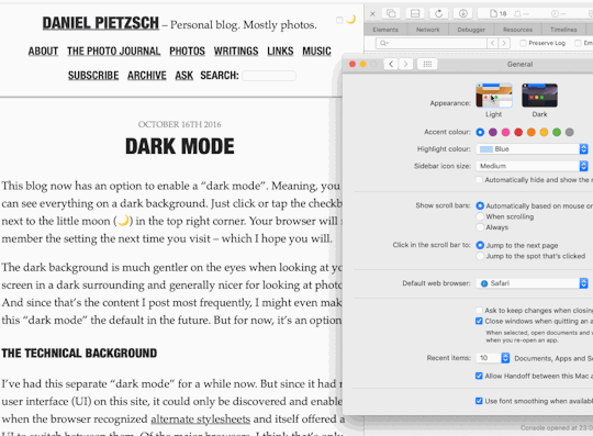
This blog has had a dark mode for a while now. Toggling it on and off could be done manually, and the selected preference would be stored in your browser for the next time you return.
I don’t know, if any other operating systems other than macOS Mojave have a “Dark Mode” preference. But, if you happen to run Mojave and use the Safari 12.1 Beta or Technology Preview, you can try this out yourself. But here’s a little GIF of what it looks like:
The whole usability around this feature is not ideal currently. For example, I should probably have a 3-way switch – On, Off, Auto – instead of a simple checkbox toggle. And I should make an “Auto” setting work without JavaScript. But I didn’t have the time for this tonight, and so this will be a little project for another time.
Iterating through an array, I found myself wanting to collect an element as-is most times, and only in certain conditions modify the original element and collect the modification instead. So, I used nextwith a parameter to skip an element quickly and move on to the next one. And that parameter will be returned and still be collected.
Much simplified example:
[1,2,3,4,5,6].collect do |n|
  next n if n%2 == 1
  n*n
end
#=> [1, 4, 3, 16, 5, 36]