I just read the article “Dark Mode Support in Webkit” on the Webkit blog. Among other things, it describes how you can opt-in to have your website auto-darkened by Webkit (which means Safari in this case):
Not all web content is simple. For this reason Safari and WebKit do not auto-darken web content — documents will need to opt-in to dark mode. The main way to signal that your content supports dark mode it to adopt the new color-scheme style property […].
Specifying the values light and dark on the root element lets the engine know both modes are supported by the document. This changes the default text and background colors of the page to match the current system appearance. Also standard form controls, scrollbars, and other named system colors change their look automatically.
So, to opt-in, you add this bit of CSS:
:root {
  supported-color-schemes: light dark; /* For current Safari versions */
  color-scheme: light dark; /* Available with Safari TP 81 */
}
This will tell the browser that your website supports both light and dark modes, and will automatically darken your website when dark mode is selected in the OS preferences. Without any additional CSS (via @media (prefers-color-scheme: dark)). That’s a super simple and convenient way to have a dark theme.
However, it is not an auto-dark mode. That property gives you dark mode ready defaults for the body background and base text color, along with form controls. Any custom colors will need handled with the prefers-color-scheme media query.
And I also re-read the article and the spec regarding this topic. And the issues listed below are no bugs. According to the spec, the user agent should indeed only change the background and text colour plus form elements, and not much more.
So, I think the below still applies. But, that it’s not “perfect” is intentional and merely gives you a mechanism to opt-in to support a very basic version and is expected to be further extended and adjusted via custom CSS statements inside a prefers-color-scheme block.
For border-color and outline-color, I could remove those statements from the standard (light mode) CSS to rely on the page’s standard colours. Then, the borders got auto-darkened, too. For the :hover-issues, I kept my custom CSS rules around.
Verdict
Relying on this auto-dark mode reduced the number of CSS statements I had to overwrite in the @media (prefers-color-scheme: dark) section of my stylesheet and made it much simpler.
Generally, for simple sites likes this one, I think it’s very handy to be able to rely on Webkit to do most of the dark-mode work for you. And then only adjust things where you see the need for.
I am definitely going to experiment with this some more.
Just learned about the CSS clamp() function. This would actually be really handy for specifying a width based font size, without the need for an extra media-query.
I amended my photo journal’s design once again. I wanted to make all images fit completely on screen, no matter what the actual dimensions of the image are.
That images wouldn’t fit was mainly an issue with photos shot in portrait orientation or in square format. If a screen was wider than it’s tall – typical for most non-mobile devices – and you had less than 960px available vertical space, those images would be cropped. That’s no longer the case. And I find it much more enjoyable when the whole picture fits on screen.
As a minor downside, this update also decreases the size of landscape-oriented images, which would still have fitted previously. But this way, everything’s aligning well and portrait and landscape images still have the same size.
My little Focal Length Equivalents tool now features “automatic dark mode” on supporting operating systems and browsers. Meaning, when you have your operating system set to prefer a “dark” styling – like macOS Mojave offers for example – and you are using a compatible browser, the page will show with a dark background and bright text. If your operating system is set to something else, it will show the default white background and black text.
Unlike for my blog, this solution uses CSS only. I simply put the required media query at the end of the CSS file(s) and by doing so, overwriting existing default colours with the ones used for dark mode.
/* AT THE END OF THE CSS FILE. DEFAULT STYLING ABOVE THIS MEDIA QUERY */
@media (prefers-color-scheme: dark) {
  body {
    color: #DDD;
    background-color: #222;
  }

  a { color: #88F; }
  a:visited { color: #AAF; }

  body > footer {
    border-top-color: white;
  }
  /* ETC ETC */
}
Overwriting the colours like this could become unmaintainable in a more complex setup, but for this little page, this works just fine.
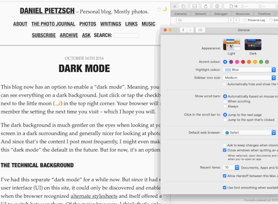
This blog has had a dark mode for a while now. Toggling it on and off could be done manually, and the selected preference would be stored in your browser for the next time you return.
I don’t know, if any other operating systems other than macOS Mojave have a “Dark Mode” preference. But, if you happen to run Mojave and use the Safari 12.1 Beta or Technology Preview, you can try this out yourself. But here’s a little GIF of what it looks like:
The whole usability around this feature is not ideal currently. For example, I should probably have a 3-way switch – On, Off, Auto – instead of a simple checkbox toggle. And I should make an “Auto” setting work without JavaScript. But I didn’t have the time for this tonight, and so this will be a little project for another time.
For my Focal Length Equivalent utility, I created a alternative view for when you don’t have JavaScript enabled (as you should, if you can).
Instead of dynamically showing the conversion based on the position of the range slider input element, I simply show a good old table with calculated equivalents at pre-defined focal lengths.
I wanted this table to list the focal lengths vertically – with one film- or sensor-format on one row – so you can easily parse the result. As such a table gets easily too wide for the parent elements container, I wanted
the table to be scrollable horizontally and
have the format name headings keep their position, so that you never lose track of which row represents which format.
The “scrolling” bit is easily done: simply put a overflow-x: scroll; on the table’s container element, which in my case is a <figure> element (a <div> or any other block element would also do of course, if the <figure> semantic doesn’t work for you):
figure {
  overflow-x: scroll;
}
In order for the film-format name headings to keep their position, I resorted to a fairly new value of the CSS position property: sticky. I added this to the th selectors, in combination with left: 0; so the headings stay at their original positions:
figure table tr th {
  position: sticky;
  left: 0;
  // you might also want a bg color, so the th covers the table
  // that scrolls through underneath
  background-color: white;
}
You can take a look at this when you go to the tool and disable JavaScript in your browser. Or you can simply look at this table here:
For tools and utilities – like my focal length equivalent site for example – I like the idea of using the UI font of the operating system it is running on. The site’s typography better blends in with the OS that way and hence makes the site seem more familiar to its visitors.
My chosen fallback is simply sans-serif. I don’t think there’s any OS that’s using a serif font on the UI. Also, specifying the popular Helvetica, Arial in addition is pretty much redundant, as one of them is the default (and probably preferred) sans-serif font on its platform anyway.
For one-column responsive layouts – like this blog for example – I like using width-based font sizes. Using the vw (view width) unit, the font size automatically scales based on the width of the viewport. It’s perfectly responsive without the need for media query breakpoints (at least initially, see below).
Here’s what I found to be a good calculation:
body {
  // 1em minimum font size (usually 16px) plus
  // 0.7% of the browser window’s total width
  font-size: calc(1em + 0.7vw);
}
This however stops working as intended, once the viewport starts becoming wider than the container the text resides in. It’s very common (for me anyway) to specify a maximum width of the main element that holds the text. But vw takes into account the width of the whole browser window, which inappropriately keeps increasing the font size, while the container width remains at the maximum width specified.
For example, this blog currently specifies a max-width of 700 pixels for its main content. So, I’d like to calculate font size based on the container width of 700px instead of the whole browser window width:
However, since the calculation is static, I ended up simply calculating it myself in ems and use that:
@media (min-width: 701px) {
  body {
    font-size: 1.306em;
  }
}
Can’t we just get max-font-size?
A note on CSS variables
While deciding on these statements above, I also tried out CSS variables to store certain values like the max-width of the container etc. to calculate the font-size like so:
need a breakpoint anyway to either redefine a variable or the calculation and
I’d need additional fallback statements for browsers that don’t understand CSS vars.
So, I decided against using them. For a more complex project, this might be a different story, but for a simple site with a pretty static design, that’d be total overkill and backwards in my opinion.
I recently learned that it’s very practical to use a unit-less number to specify the CSS line-height. Unlike using a unit – like em, for example – this will make the line-height dependent on the text’s font-size, instead of being an absolute value.
Here’s a little example.
The markup (excerpt):
<body>
  Lorem ipsum dolor sit amet, consectetur adipiscing elit, sed do eiusmod tempor incididunt ut labore et dolore magna aliqua.

  <p>
    Lorem ipsum dolor sit amet, consectetur adipiscing elit, sed do eiusmod tempor incididunt ut labore et dolore magna aliqua.
  </p>

  <blockquote>
    Lorem ipsum dolor sit amet, consectetur adipiscing elit, sed do eiusmod tempor incididunt ut labore et dolore magna aliqua.
  </blockquote>
</body>
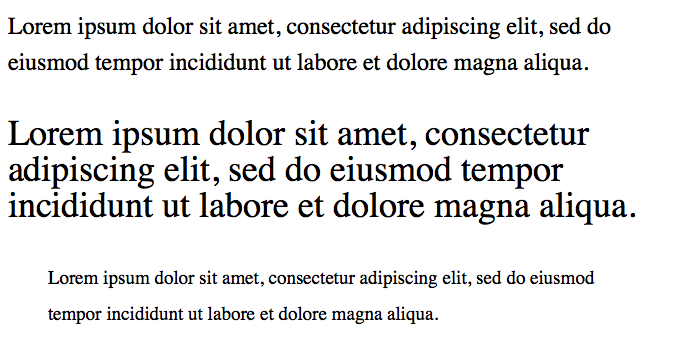
And here’s the CSS with unit, and the corresponding screenshot:
body {
  font-size: 1.5em; // 24px
  line-height: 1.5em; // 36px
}
p          { font-size: 1.5em; } // 36px, line-height still at 36px
blockquote { font-size: 0.8em; } // 19.2px, line-height still at 36px
Line spacing with em unit
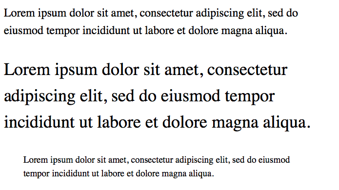
And here’s the CSS without unit. This looks far more balanced:
Using a unit-less number seems to be a better default, because the text generally looks better when its line height is based on its font size. I seem to need less line-height statements in total and the typography looks generally more appealing.
As I start adding content to this blog more regularly, I thought I update – and I think improve – its design a little. Today I updated the headings and navigation links.
While I was previously using a single serif font for the whole site, I now introduced a second font for the mentioned elements: “Helvetica Neue Condensed Bold”.
I think this font is a good pairing to the serif body font. The upper-case Helvetica more clearly separates posts from one another and makes navigation links stand out more.
I often think a two-font serif/sans-serif pairing looks good and I’m glad I now found one that I like using fairly common fonts. I particularly like it because of the condensed variant (my thanks goes to zeldman.com for the inspiration).
Implementation
During implementation, I noticed it wasn’t very consistent to implement across Mac/iOS browsers, though.
Normally the following CSS should have been enough in my opinion:
For Safari and Firefox on a Mac, this is enough indeed and for iOS as well. But Chrome on the Mac wouldn’t show the condensed variant of the font. I had to add the condensed variant (its Postscript name to be precise) as a font-family:
This made Chrome (and Opera) show the same condensed version on a Mac as the other two browsers. For Safari however, this overwrites the "Helvetica Neue" + font-stretch statement again. But Firefox seems to ignore the additional font-family and still uses the font-stretch statement.
Anyhow, this works now and I thought I share this little CSS-inconsistency finding here.
In a future update I might look into having Android and Windows show a condensed font, but for now I’m fine with the fallbacks in this font stack.
Here’s a little CSS-snippet that let’s you select only photos of a certain orientation in your Tumblr theme.
A little warning up-front: it’s not foolproof. It relies on that you post high-resolution photos at a size that fills Tumblr’s maximum photo dimensions, which means, landscape photos should be at least 1280px wide and portrait photos should be 1920px tall.
Update 29.04.2015: I was wrong with assuming portrait photos are always 1920px high. They of course also max out at 1280px in width. So I’ve updated the post to still make it work.
So, here’s how to do it:
The HTML img-tag must specify the width and height attributes. Like this, for example:
This gives you the ability to select images of a certain orientation with a combination of the CSS attribute-selectors and the negation pseudo-class. Assuming your photos are always 1280px wide – no matter if they’re landscape or portrait – you’ll need to specify a :not-selector for each aspect ratio’s height you’re going to use.
So, for example, for a 2:3-ratio, the height would be 1920px and hence the selector would need to reflect that.
Here’s an example how I select only landscape photos by excluding images that have a portrait orientation and have an aspect ratio of 2:3 and 3:4. I use this to make landscape images wider than the otherwise 700px-wide container:
/* only for displays wider than 900px */
@media (min-width: 900px) {
  /* selects landscape <img>s by selecting only the ones that are 1280px wide, and not 1920px tall */
  main .post.photo.photos img[width="1280"]:not([height="1920"]):not([height="1707"]) {
    max-width: 900px;
    margin-left: -100px;
  }
}
For selecting only landscape photos, you can just use img[height="1920"]img[height="1707"].
Again, this won’t work, if you do not upload high-res images. But if you do and want to style photos differently based on their orientation, this might be a good-enough solution for you, too.
The brilliant Paul Irish built a CSS3 rule generating web app that he calls, “CSS3, Please!” Using automated vendor specific code, you can make box-shadow, gradient, rgba, even rotate, work in IE, Mozilla and WebKit.