Eventually I will run this blog on different software and leave Tumblr. Tumblr is what powers this blog. It has served me well, and still is. But I am feeling increasingly discontent.
The main reason I feel this way is that I want to have more control over the technology that runs my blog/website. Although this is more work (but more fun!), I think it’s the only viable long-term solution. You never know, if Tumblr will still be around in a few years time. Plus I’ll have a better idea where my data is located and that it’s not directly fed into a third party system/social network.
Plus I dislike some things they do:
They won’t let me directly link to a different website. It’s always going through their redirecting service. It makes the browser status bar pretty much useless, plus I’d like to be the direct referrer to other sites.
I have the suspicion it promotes Tumblr to my visitors, although I turned that off.
It often shows a their privacy policy screen one has to accept when visiting pages on Tumblr. I don’t know if that’s the case for custom domains, too, but I think it is. That’s annoying.
I get regularly distracted by other people’s posts on my Tumblr Dashboard, when I only came here to post something. This is good and bad at the same time.
But these are comparably minor things. I simply want to be more in control and have something that I can comfortably run long-term.
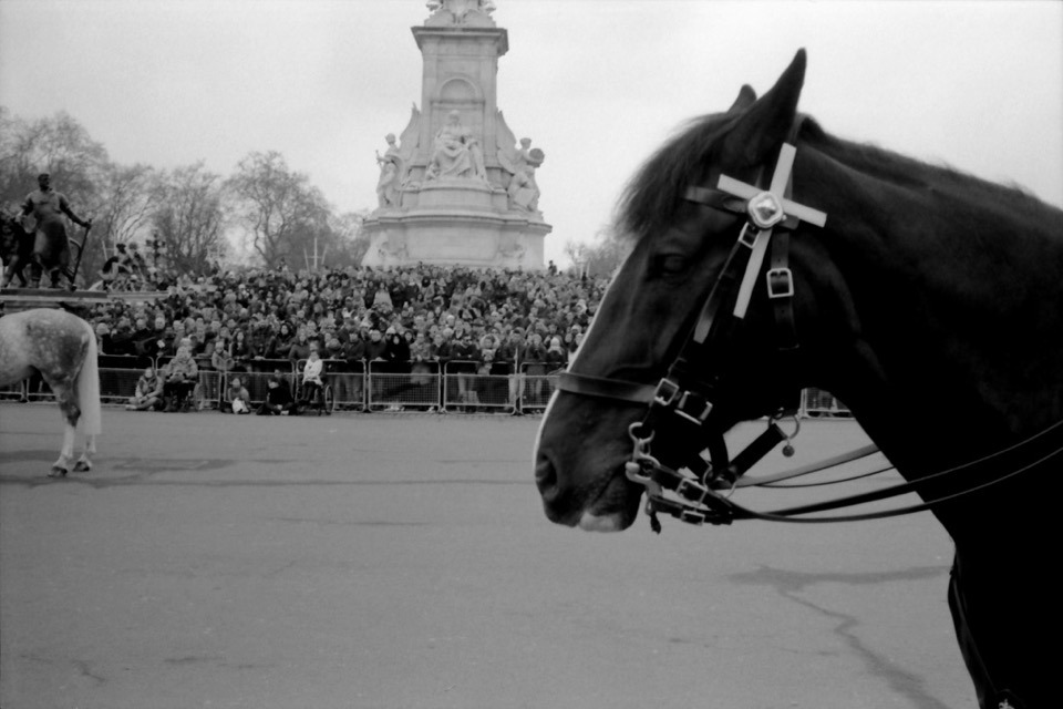
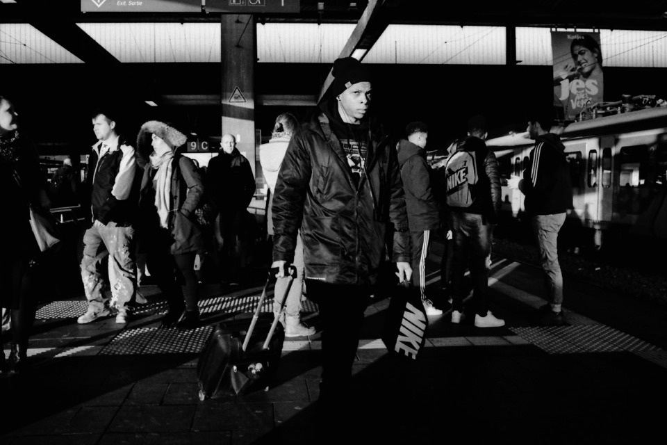
I just noticed Severin Koller has an updated homepage. There’s a bunch of photos I haven’t seen or forgot about. So I think I know what I’m going to do tonight.
He’s one of my favourite photographers and a major reason I’m shooting film. I especially like his street and documentary work, but his portraits are wonderful, too. And his other stuff as well. Go check it out!
If you like what you see, I encourage you to check out his blog, which is one of the best sites on the internet. Just wonderful – and more personal – street and documentary photographs. He’s got such a great eye for moments – from subtle gestures to more obvious juxtapositions – and an incredible skill to capture them. And you can basically follow his life for the last decade.
Here’s a quick tip for getting two rolls of 120 format film onto a single plastic development reel consitently and safely (i.e. wihout having the films overlap inside the tank):
Warm up the reel before winding on the films.
The reel should be dry to begin with. To warm it up, I simply put it out in the sun for a couple of minutes or use a hair dryer for a few seconds.
I’ve read this tip on a forum somewhere, and I haven’t had issues since I started following it.
Detailed instructions
When you have warmed up the reel, put everything in the darkbag (or darkroom) and start loading the first roll as you normally would.
Once you’ve ratcheted it on, use your fingers (as the ratcheting won’t work once the film is on completely) to keep winding it on until it hits the inner end of the reel. (Since I can’t handle the film on its side for this, I do touch the film directly.) Because the reel is dry and warm, this should work without resistance from the material. If you feel you have to force it, there’s a good chance you won’t get the film in completely. In this case, I would start from scratch or bite the bullet, and simply develop only one roll this time around.
Once the first roll is in, load the second roll as you did the first. Both ratcheting or simply pushing the film on do work in my experience. Make sure to not wind it in too far. There’s not much extra space on these reels, so stop winding as soon as the second one is on completely.
That’s it! Now you can start developing.
What I’m using
I am using a Kaiser Developing Tank with plastic reels for my film developing, which can hold two reels with one 35mm film each, or a single, expanded reel to hold medium format film. The only way to develop more than one 120 roll in a tank like this, is to spool two onto a single reel. And with it comes the risk of having the films overlap.
If you’re using a different tank system, this tip should also apply as long as the reels are plastic.
I tried loading more than one film several times before following this tip. It sometimes worked, and sometimes didn’t. Which meant I had films overlapping (quite substantially at times) and I lost quite a few negatives, because they came out undeveloped or only partially developed.
This one was on the verge of being lost.Most lost frames look much worse than this, where you can’t even figure out what was being photographed. And most frames I didn’t even scan.
Bonus tips for developing 120 film
Peel off half of the tape that holds each film roll together before placing it into the darkbag. This makes it easier to open the roll in the dark.
Always use enough developer (probably more than it says in the instructions for 120 film). Without a second reel to hold everything in place, there’s a good chance it’ll slide up a little during agitation, and will no longer be completely covered by the developer.
An example where I didn’t have enough developer in the tank. The shape of the undeveloped parts on the right comes from all the air bubbles that accumulate around the developer surface.
Find the 35mm/full-frame equivalent to a focal length in different sensor- or film-format.
Between Christmas and New Year’s – or “between ze days” as we say in Germany – I worked on a little project: Focal Length Equivalents, a website that let’s you look up focal lengths of different film- or sensor-formats and find its equivalent to the 35mm/full-frame format.
Here’s some more explanation from that new site:
Like a lot of photographers, you might be familiar with focal lengths in the 35mm/full-frame image format and what field of view that focal length represents (24 mm = wide angle, 50 mm = “normal” etc.). Different formats, however, require different focal length lenses to produce an equivalent field of view.
With this site, you can look up these focal lengths and their 35mm-equivalents.
For example, when I bought my 6x9 camera, I wanted to know what its lens’ 110 mm equivalent field of view is in the 35mm format – because that’s the format I’m most familiar with. And when looking up information like this I always end up looking through some old forum threads, if I don’t want to calculate it myself (which I never did).
That’s why I built this little utility, which calculates it for me and saves me the search. Check it out!
The UI
The UI is a table that dynamically updates as you move a slider. That slider is an HTML input element of type range.
My idea was to create a super-simple interface that’s easy to use on both mobile and desktop – i.e. with a touch interface as well as a mouse/trackpad. There’s nothing to type into a field and no button to push to recalculate. Simply move the slider.
Another benefit of this is, that you are always comparing all formats at once. No need to select or otherwise “activate” a specific format. You simply look at the row of the format that interests you to compare (tip: you can tap/click on a row to highlight it for even easier visual comparison).
Drawbacks
A drawback of this UI is, that the slider is somewhat fiddly to operate. And it’s a not very precise UI element, either. I might be able to make it less fiddly by creating a custom design for the slider. But the imprecision will always be there I assume, especially on smaller screens where the input’s values are spread across less horizontal space. I limited the focal lengths you can compare to mitigate this issue at least a little – but this is yet another drawback itself.
This is the MVP
This version is a MVP – a Minimum Viable Product. There’s quite a few things I have in mind to improve the UI or better communicate each format’s dimensions (which are the base for the calculation), and also add more formats. But I think it’s already quite useful, and that’s why I’m making it public right now.
As I start adding content to this blog more regularly, I thought I update – and I think improve – its design a little. Today I updated the headings and navigation links.
While I was previously using a single serif font for the whole site, I now introduced a second font for the mentioned elements: “Helvetica Neue Condensed Bold”.
I think this font is a good pairing to the serif body font. The upper-case Helvetica more clearly separates posts from one another and makes navigation links stand out more.
I often think a two-font serif/sans-serif pairing looks good and I’m glad I now found one that I like using fairly common fonts. I particularly like it because of the condensed variant (my thanks goes to zeldman.com for the inspiration).
Implementation
During implementation, I noticed it wasn’t very consistent to implement across Mac/iOS browsers, though.
Normally the following CSS should have been enough in my opinion:
For Safari and Firefox on a Mac, this is enough indeed and for iOS as well. But Chrome on the Mac wouldn’t show the condensed variant of the font. I had to add the condensed variant (its Postscript name to be precise) as a font-family:
This made Chrome (and Opera) show the same condensed version on a Mac as the other two browsers. For Safari however, this overwrites the "Helvetica Neue" + font-stretch statement again. But Firefox seems to ignore the additional font-family and still uses the font-stretch statement.
Anyhow, this works now and I thought I share this little CSS-inconsistency finding here.
In a future update I might look into having Android and Windows show a condensed font, but for now I’m fine with the fallbacks in this font stack.
Back in October I impulse-bought my first fold-out 6x9 camera at the Photobörse Ratingen (a kind of cameras-only flea market and trade show).
It’s some Voigtländer Bessa with a 110 mm lens and a maximum aperture of f/4.5:
I’ve fancied having a camera like this for a while now. Because I imagine them being great for landscapes: they are compact, relatively light and pretty robust – which is good when you’re hiking. They have an aspect ratio well suited to landscapes and the negative size is the largest medium format has to offer (panoramic cameras aside).
And my demands for its controls are not very high, either. I only plan to use it outdoors at daylight, which means that
the aperture doesn’t have to be large, nor has the lens to be a great performer wide open,
the exposure has to be set only once in a while, so controls don’t have to be super-convenient, and
I don’t need to focus accurately, because for the most part, I will set it to infinity and forget about it.
That’s why a cheap model like this one will do.
Last month I finally went out with a roll of Fomapan 100 to see if it’s working properly. And it is: No light leaks, most shutter speeds seem to be accurate, the aperture works, focus works, lens works. It’s not very nice at f/4.5, but much better at f/5.6 and from f/8 and above seems to render perfectly fine. Which I’m happy with.
I’m looking forward to trying this out on a proper hike, but for now, here are a few shots from that test-run:
I like to write. I definitely like having written. I want to get better at it. I want to remember things better. I want to share what I learned. And what interests me. Or simply jot down my thoughts. I want to create more value – even if it’s very little or only for myself.
Posts may be short. Posts may be long. Some will lack. A few might be strong. It can be common. It can be personal. It can be profound. Or rather trivial.
I’m way behind with posting this year’s photos. But at least here’s a new little set.
Shooting film while travelling for a couple of months at a time and not doing any interim development or scanning makes you fall behind really quickly. I’ve now at least developed all rolls – 35mm as well as medium format – from May through July. Scanning and editing is a whole different story, though.