Sometimes I just feel like reading a bunch of articles on Eric Kim’s blog.
Being ready to shoot
Reading my posts in the “How I took the shot” series, I realised they might come across as brag. But that’s not what I’m trying to say.
My point is rather, that in street photography there’s always a lot of luck involved – simply because for candid street shots you can’t plan anything. But also – that being patient and prepared are valuable skills to get better at as a street photographer.
By “being prepared” I mean both paying attention as well as having your camera set up correctly. There were many more unsuccessful attempts in the past where I waited and nothing interesting was happening. Or I didn’t wait long enough. Or I didn’t get the shot, because
- I was not paying attention or
- my settings weren’t right or
- I wasn’t quick enough or
- I didn’t dare to take the shot.
And that’s way worse: You can’t do anything about it when nothing interesting happens. But you can be ready, if it does. So I try to eliminate these four issues as much as I can. And then I’m sometimes even at the right place at the right time.

How I took the shot: Part 2.
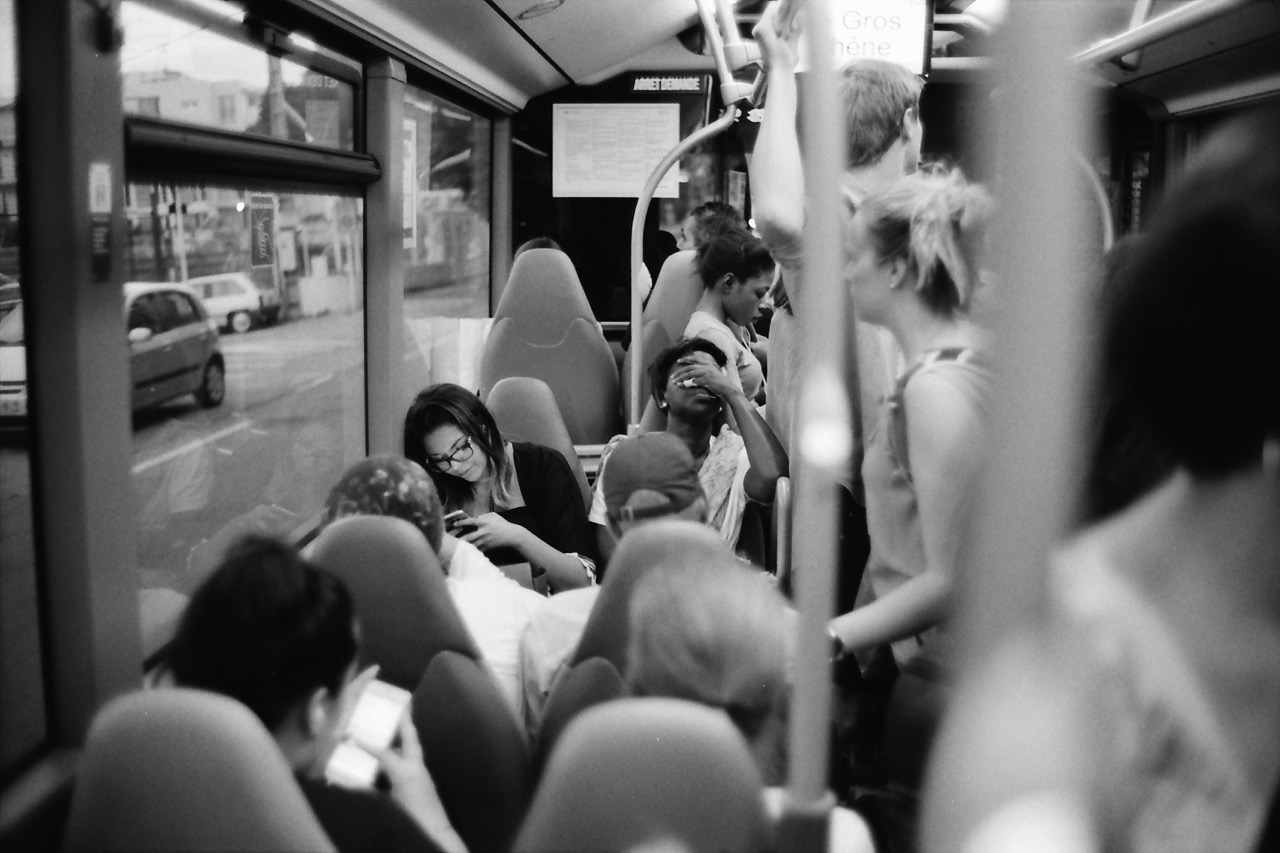
This photo was taken last June on a bus ride back from Nice to our campground. The challenge with this one was to be observant, quick and shooting in a moving vehicle while having other things to do, too.
After I got onto the bus, I took a read from my exposure meter on my iPhone to get a ballpark exposure for the bus’s interior. I preset my exposure to f/1.4 and 1/60th of a second (for my APX 400 film). I rarely shoot this lens at its maximum aperture, but this time I decided to do so, because I was on a moving bus and wanted to avoid motion blur.
I noticed this woman and I sensed she might make an interesting subject matter: she seemed tired and generally exhausted from the day. Because this was the most promising scene, I preset the focus already, too, using a person or object at the same distance1.
Then it was time to wait. It was a long bus ride.
And it took a while, but the waiting paid off. She had her hand over her eyes like this for maybe one to two seconds. Luckily I noticed. And because my Leica was around my neck, ready to shoot, I quickly raised it to my eye and took this photo.
Inside, I quietly went: “YES!”
Maybe all of this would have been trivial, if I was shooting a digital camera with auto-exposure and auto-focus. But who knows? Maybe then the auto-focus had missed or the camera wasn’t even powered on. ↩︎
Simple CSS system font stack
For tools and utilities – like my focal length equivalent site for example – I like the idea of using the UI font of the operating system it is running on. The site’s typography better blends in with the OS that way and hence makes the site seem more familiar to its visitors.
Here’s the simple CSS statement I’m using:
font-family: system-ui, sans-serif;
system-ui seems to be the new standardised value for using the default operating system font. It’s not supported in all browsers, but coverage is not bad at all.
My chosen fallback is simply sans-serif. I don’t think there’s any OS that’s using a serif font on the UI. Also, specifying the popular Helvetica, Arial in addition is pretty much redundant, as one of them is the default (and probably preferred) sans-serif font on its platform anyway.
Yesterday I visited the Webworker NRW Meetup in Düsseldorf. I used to visit their meet ups regularly, but haven’t been to a single one in recent years. Simply because I wasn’t here all that much.
Last evening was about Vue.js. I haven’t worked with any of the three currently most popular (or shall I say hyped?) JavaScript frameworks – React, Angular and Vue – so this was a good opportunity to start learning about them.
The Meetup itself has grown quite a bit. When I went the last time, it was still held at Garage Bilk with maybe up to 30-35 visitors maximum. The venue is now at Sipgate and there were around 130 people. The new home is great: their staff welcomes you, flawless technical setup and free snack and drinks.
So, I drank a little, I ate a little, met Stefan, and learned about Vue.js. Successful outing.
We currently live close to the local library. It’s a great institution to have nearby. Not only can we conveniently rent out books, magazines and other media for us adults, we can regularly get Zoe new children’s books for free and return them once she loses interest. She currently loves books, so this is very handy.
I love books, too. Mainly photo books. And today I bought not rented: during our visit Zoe let me browse their current “For Sale”-shelves for like two minutes and I was able to pick a few that interested me. After learning about the price, I bought them all. It was €10 altogether. I probably would have paid this for the Magnum book alone.

I’m very happy about these very affordable finds, but I’m worried I have photo book tsundoku or BAS: Book Acquisition Syndrome.
CSS width-based font size
For one-column responsive layouts – like this blog for example – I like using width-based font sizes. Using the vw (view width) unit, the font size automatically scales based on the width of the viewport. It’s perfectly responsive without the need for media query breakpoints (at least initially, see below).
Here’s what I found to be a good calculation:
body {
  // 1em minimum font size (usually 16px) plus
  // 0.7% of the browser window’s total width
  font-size: calc(1em + 0.7vw);
}
This however stops working as intended, once the viewport starts becoming wider than the container the text resides in. It’s very common (for me anyway) to specify a maximum width of the main element that holds the text. But vw takes into account the width of the whole browser window, which inappropriately keeps increasing the font size, while the container width remains at the maximum width specified.
For example, this blog currently specifies a max-width of 700 pixels for its main content. So, I’d like to calculate font size based on the container width of 700px instead of the whole browser window width:
@media (min-width: 701px) {
  body {
    font-size: calc(1em + 700px * 0.007);
  }
}
However, since the calculation is static, I ended up simply calculating it myself in ems and use that:
@media (min-width: 701px) {
  body {
    font-size: 1.306em;
  }
}
Can’t we just get max-font-size?
A note on CSS variables
While deciding on these statements above, I also tried out CSS variables to store certain values like the max-width of the container etc. to calculate the font-size like so:
:root {
  --container-max-width: 100vw;
  --base-font-size: 1em;
  --container-fraction: 0.007; /* 0.7% */
}

body {
  font-size: calc(
    var(--base-font-size) +
    var(--container-fraction) *
    var(--container-max-width));
}

@media (min-width: 701px) {
  body {
    --container-max-width: 700px;
  }
}
But with this I
- need a breakpoint anyway to either redefine a variable or the calculation and
- I’d need additional fallback statements for browsers that don’t understand CSS vars.
So, I decided against using them. For a more complex project, this might be a different story, but for a simple site with a pretty static design, that’d be total overkill and backwards in my opinion.
Do Not Look Down
I can’t get enough of Meshuggah at the moment. And in particular this song. Such a mean groove!
In good Meshuggah fashion, it’s polymetered: The first riff for example is in 17/8 (that’s how I count it anyway), and both guitars/bass and drums play it like this initially. But after the first 8 bars (around the 26 second mark, after 2 rounds of that riff), the drummer’s hands start playing 4/4 time while his feet and the guitars stay in 17/8. From then on, the drumming stays that way. Which means you can easily nod your head all the way through, even though that might not be immediately obvious.
There’s a lot more going on throughout the whole song (which I haven’t completely analysed like this), and it’s so fun to listen to that I keep coming back over and over again.
DuckDuckGo — Privacy, simplified.
The Internet privacy company that empowers you to seamlessly take control of your personal information online, without any tradeoffs.
For years now, I’ve been using DuckDuckGo as my search engine.
In 98% of the cases, it gets me what I’m searching for1. Unlike Google, it respects your privacy: they don’t track you!
DuckDuckGo is easily setup as your default search engine in every popular browser – both on desktop or mobile computers/phones. I use it on all my devices and I don’t want to go back.
You should give it a try, too!
In the 2% it doesn’t, I still resort back to Google, though. :-( ↩︎
Why I love shooting film: The Look
I simply love how film looks. Especially the black and white variety. Both as a digital file scanned from a negative and – especially – as a gelatin silver print (which I’m not remotely creating enough of).
Admittedly, I had to get used to the 35mm look, but now it’s hard for me to go back. The low(er) resolution and graininess are no longer bugs – they’re features1. Digital looks too clean to me. And while I can still enjoy and consume and be impressed by digital photographs, and while you can also simulate the film look in post, it’s not what I’m currently interested in for my own photography2.
Film has this aesthetic that’s more detached from reality. I don’t know how to best describe it. Film not only looks great to me, it also makes me feel differently.

Unit-less CSS line-height
I recently learned that it’s very practical to use a unit-less number to specify the CSS line-height. Unlike using a unit – like em, for example – this will make the line-height dependent on the text’s font-size, instead of being an absolute value.
Here’s a little example.
The markup (excerpt):
<body>
  Lorem ipsum dolor sit amet, consectetur adipiscing elit, sed do eiusmod tempor incididunt ut labore et dolore magna aliqua.

  <p>
    Lorem ipsum dolor sit amet, consectetur adipiscing elit, sed do eiusmod tempor incididunt ut labore et dolore magna aliqua.
  </p>

  <blockquote>
    Lorem ipsum dolor sit amet, consectetur adipiscing elit, sed do eiusmod tempor incididunt ut labore et dolore magna aliqua.
  </blockquote>
</body>
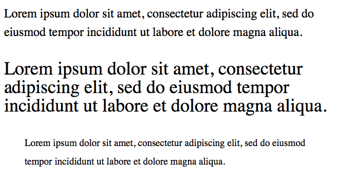
And here’s the CSS with unit, and the corresponding screenshot:
body {
  font-size: 1.5em; // 24px
  line-height: 1.5em; // 36px
}
p          { font-size: 1.5em; } // 36px, line-height still at 36px
blockquote { font-size: 0.8em; } // 19.2px, line-height still at 36px
And here’s the CSS without unit. This looks far more balanced:
body {
  font-size: 1.5em; // 24px
  line-height: 1.5; // 36px
}
p          { font-size: 1.5em; } // 36px,   line-height: 54px
blockquote { font-size: 0.8em; } // 19.2px, line-height: 28px
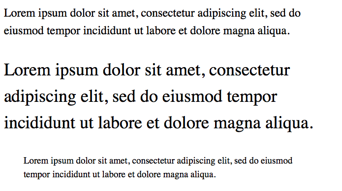
Using a unit-less number seems to be a better default, because the text generally looks better when its line height is based on its font size. I seem to need less line-height statements in total and the typography looks generally more appealing.
I’m currently discovering quite a few new tricks regarding the front-end web developing world, due to working on some side-projects and redesigning this blog. So, there are a handful of posts about HTML, CSS and JavaScript coming up.
While out in the city today shopping with my daughter, I got unsolicited parenting advice. Apparently I was allowing something they would’ve never allowed. That person basically told me I’m a bad parent. I was flabbergasted. And offended.
What’s wrong with people? How rude can you be? I overheard one comment in the past, and also heard from friends complaining about similar experiences. This was the first time I got into an argument with someone. I have the suspicion it won’t be the last time.
How I took the shot: Part 1.
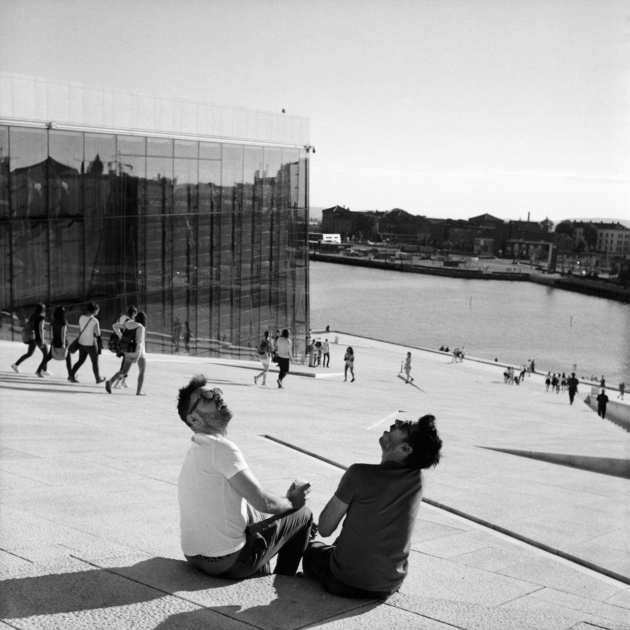
This photo was taken in 2016 at the opera house in Oslo with my Rolleiflex. It’s my favourite one of several images I took there.
Patience and luck were responsible for getting this shot. I was standing at this very spot for approximately 1 to 2 minutes already, having the camera pointed this way, patiently looking down into it. I was waiting for some gesture or anything else interesting happening between those two. And then out of nowhere this helicopter flew over and they turned around – looking up – the way you see on the image. That they are pretty much look-alikes is just the cherry on top.
This was way better than I could have anticipated. I couldn’t quite believe it when I took the shot (and I only had one chance, as after advancing to the next frame, the scene was gone), and was thrilled when I finally got to see the negative after I developed the roll.
$input.setAttribute vs. $input.value
If you want to set the current value of an HTML input element using JavaScript, use .value instead of .setAttribute to do so. Example:
//sets the current value
document.getElementById('FIELD-ID').value = 200
//sets the value attribute, i.e. the default value
document.getElementById('FIELD-ID').setAttribute('value', 200)
This makes sense now, but was something I was a little confused about recently. Of course, setAttribute sets the default value. Because that’s what the value attribute on an input is for. I meant to change the current value, though, but was trying to use setAttribute for that (which strangely enough worked for my purposes in Safari and Firefox, but not Chrome).
Anyhow, that’s my little reminder to self and my little piece of writing for the day.