While I am speaking of Zoe: she is so much fun at the moment! She’s walking and running, she’s talking (sort of, in her toddler way), she’s dancing, she’s cuddly, she understands a lot of what we say, she’s curious, and – to our great delight – she started giving out kisses, too. 😍
Spent most of the day with dad clearing out our cellar and his old stockroom and driving all the things to various recycling facilities.
Things finally had to go.
I don’t think I am required to do any additional sports this week.
And the highlight of my day was returning home: I’m currently rarely gone for an entire day, which is probably why Zoe was so happy to see me again. She gave me the biggest and longest hug I’ve received from her ever. Best thing in the world! :-)
The browser I currently use
On both my Mac and my iOS devices, I use Safari as my main browser. It’s fast, secure, prevents tracking, syncs across platforms and makes the best use of the underlying OS’s resources and hence helps with long battery life. And since it recently gained the ability to show favicons on each tab, there’s not much I’m missing.
Ideally though, I would use Mozilla’s Firefox. It’s just as good. And furthermore, it’s developed by a not-for-profit organisation and the only major browser – complete with its own rendering engine Gecko – that’s not maintained by one of the enormous global for-profit corporations. Which is good for the diversity of the browser landscape and the web as a platform.
What’s holding me back, though, is that I can’t specify a different default browser on iOS. Yes, I enjoy seemingly best battery life using Safari, but I would trade this for using an independent browser. But it’s pretty inconvenient to have links always open in Safari when my main browser is actually something else.
While it’s shitty enough1 that Apple doesn’t allow different rendering engines on iOS2, it seems deliberately anticompetitive they don’t allow you to specify another default browser.
Can’t someone force Apple to make this change, please?
And regarding Google’s Chrome (which is the browser with the biggest market share): I can’t think of a reason to use it as my main browser. For me, it doesn’t offer anything better than Safari or Firefox and it’s from a company I have low trust in.
Why I love shooting film: no instant feedback
One of the biggest advantages for me when shooting film is that after taking the photo, there’s nothing to see. Neither I nor anyone else can see the photo I just took. This keeps me and everyone else in the moment.
With film, it’s clear you can’t see the image immediately. And so nobody wonders or asks. No checking possible of how something or someone looks in the photograph. It’s less intrusive compared to a camera with a screen.
That makes film perfect for me when capturing moments with family and friends: because in these settings I’m a participant first and a photographer second.

Didn’t manage to finish the article I originally intended to publish. Instead, I spent too much time today on some custom map tiles implementation for an app. But it’s Friday night. I should start fresh on Monday.
I think I’ll now have a beer and develop the two rolls of 120 film from December I have still lying around.
Range input with datalist
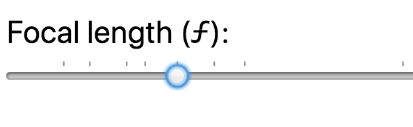
There’s another little tidbits I learned while working on the focal length equivalent tool: The HTML range-type <input> can have an associated <datalist> element to enhance its interface.
The datalist can specify input values as an <option> element. Supporting browsers – like Chrome for example – use this information to put little marks along the top of the range slider to indicate positions (= values) of particular interest.
I use this feature to mark common focal lengths in the 35mm format: 10 mm, 16 mm, 24 mm, 28 mm, 35 mm, 43 mm, 50 mm, 85 mm, 100 mm, 135 mm, and 200 mm.
What’s even cooler, is that Chrome lets the input’s handle snap to these positions.
Here’s a enlarged screenshot of what it looks like:
Horizontally scrolling table with fixed headings
For my Focal Length Equivalent utility, I created a alternative view for when you don’t have JavaScript enabled (as you should, if you can).
Instead of dynamically showing the conversion based on the position of the range slider input element, I simply show a good old table with calculated equivalents at pre-defined focal lengths.
I wanted this table to list the focal lengths vertically – with one film- or sensor-format on one row – so you can easily parse the result. As such a table gets easily too wide for the parent elements container, I wanted
- the table to be scrollable horizontally and
- have the format name headings keep their position, so that you never lose track of which row represents which format.
Here’s the simplified table markup:
<figure><table><tbody><!-- ... --><tr><th scope="row">35mm</th>
        <td>10 mm</td>
        <td>16 mm</td>
        <td>24 mm</td>
        <td>28 mm</td>
        <td>35 mm</td>
        <td>50 mm</td>
        <td>85 mm</td>
        <td>100 mm</td>
        <td>135 mm</td>
        <td>200 mm</td>
        <td>300 mm</td>
        <td>500 mm</td>
      </tr><!-- ... --></tbody></table></figure>
The “scrolling” bit is easily done: simply put a overflow-x: scroll; on the table’s container element, which in my case is a <figure> element (a <div> or any other block element would also do of course, if the <figure> semantic doesn’t work for you):
figure {
  overflow-x: scroll;
}
In order for the film-format name headings to keep their position, I resorted to a fairly new value of the CSS position property: sticky. I added this to the th selectors, in combination with left: 0; so the headings stay at their original positions:
figure table tr th {
  position: sticky;
  left: 0;
  // you might also want a bg color, so the th covers the table
  // that scrolls through underneath
  background-color: white;
}
You can take a look at this when you go to the tool and disable JavaScript in your browser. Or you can simply look at this table here:
| Micro 4/3 | 5 mm | 8 mm | 12 mm | 15 mm | 18 mm | 26 mm | 44 mm | 52 mm | 70 mm | 104 mm | 156 mm | 260 mm |
|---|---|---|---|---|---|---|---|---|---|---|---|---|
| APS-C | 7 mm | 11 mm | 16 mm | 19 mm | 23 mm | 33 mm | 57 mm | 67 mm | 90 mm | 133 mm | 200 mm | 333 mm |
| 35mm | 10 mm | 16 mm | 24 mm | 28 mm | 35 mm | 50 mm | 85 mm | 100 mm | 135 mm | 200 mm | 300 mm | 500 mm |
| 6x4.5 | 16 mm | 26 mm | 39 mm | 45 mm | 56 mm | 81 mm | 137 mm | 161 mm | 217 mm | 322 mm | 483 mm | 805 mm |
| 6x6 | 18 mm | 29 mm | 44 mm | 51 mm | 64 mm | 92 mm | 155 mm | 183 mm | 247 mm | 366 mm | 548 mm | 915 mm |
| 6x7 | 20 mm | 32 mm | 48 mm | 56 mm | 71 mm | 101 mm | 171 mm | 202 mm | 272 mm | 404 mm | 604 mm | 1009 mm |
| 6x8 | 22 mm | 35 mm | 53 mm | 62 mm | 77 mm | 110 mm | 187 mm | 220 mm | 297 mm | 440 mm | 660 mm | 1100 mm |
| 6x9 | 23 mm | 37 mm | 56 mm | 65 mm | 82 mm | 117 mm | 198 mm | 233 mm | 315 mm | 467 mm | 700 mm | 1167 mm |
| 4x5 | 36 mm | 57 mm | 85 mm | 99 mm | 124 mm | 177 mm | 301 mm | 354 mm | 478 mm | 708 mm | 1061 mm | 1769 mm |
| 8x10 | 71 mm | 113 mm | 170 mm | 198 mm | 248 mm | 354 mm | 601 mm | 707 mm | 955 mm | 1415 mm | 2122 mm | 3537 mm |
Reclaim gigabytes of disk space used by Xcode
I recently cleaned up my Mac to free up disk space. And the best bang for the buck was from reclaiming disk space from Xcode and its tools. I got back several gigabytes.
So, if you use Xcode and you are in need of some disk space, here are a few directories where I’d look to see what you no longer need:
/Applications/Xcode.app/Contents/Developer/Platforms
~/Library/Developer/CoreSimulator/Devices
~/Library/Developer/Xcode/iOS DeviceSupport/
Sometimes I just feel like reading a bunch of articles on Eric Kim’s blog.
Being ready to shoot
Reading my posts in the “How I took the shot” series, I realised they might come across as brag. But that’s not what I’m trying to say.
My point is rather, that in street photography there’s always a lot of luck involved – simply because for candid street shots you can’t plan anything. But also – that being patient and prepared are valuable skills to get better at as a street photographer.
By “being prepared” I mean both paying attention as well as having your camera set up correctly. There were many more unsuccessful attempts in the past where I waited and nothing interesting was happening. Or I didn’t wait long enough. Or I didn’t get the shot, because
- I was not paying attention or
- my settings weren’t right or
- I wasn’t quick enough or
- I didn’t dare to take the shot.
And that’s way worse: You can’t do anything about it when nothing interesting happens. But you can be ready, if it does. So I try to eliminate these four issues as much as I can. And then I’m sometimes even at the right place at the right time.

How I took the shot: Part 2.
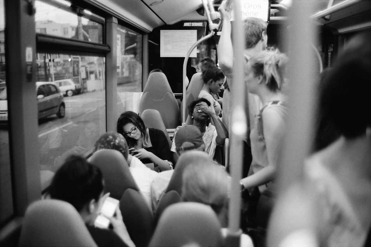
This photo was taken last June on a bus ride back from Nice to our campground. The challenge with this one was to be observant, quick and shooting in a moving vehicle while having other things to do, too.
After I got onto the bus, I took a read from my exposure meter on my iPhone to get a ballpark exposure for the bus’s interior. I preset my exposure to f/1.4 and 1/60th of a second (for my APX 400 film). I rarely shoot this lens at its maximum aperture, but this time I decided to do so, because I was on a moving bus and wanted to avoid motion blur.
I noticed this woman and I sensed she might make an interesting subject matter: she seemed tired and generally exhausted from the day. Because this was the most promising scene, I preset the focus already, too, using a person or object at the same distance1.
Then it was time to wait. It was a long bus ride.
And it took a while, but the waiting paid off. She had her hand over her eyes like this for maybe one to two seconds. Luckily I noticed. And because my Leica was around my neck, ready to shoot, I quickly raised it to my eye and took this photo.
Inside, I quietly went: “YES!”
Maybe all of this would have been trivial, if I was shooting a digital camera with auto-exposure and auto-focus. But who knows? Maybe then the auto-focus had missed or the camera wasn’t even powered on. ↩︎
Simple CSS system font stack
For tools and utilities – like my focal length equivalent site for example – I like the idea of using the UI font of the operating system it is running on. The site’s typography better blends in with the OS that way and hence makes the site seem more familiar to its visitors.
Here’s the simple CSS statement I’m using:
font-family: system-ui, sans-serif;
system-ui seems to be the new standardised value for using the default operating system font. It’s not supported in all browsers, but coverage is not bad at all.
My chosen fallback is simply sans-serif. I don’t think there’s any OS that’s using a serif font on the UI. Also, specifying the popular Helvetica, Arial in addition is pretty much redundant, as one of them is the default (and probably preferred) sans-serif font on its platform anyway.
Yesterday I visited the Webworker NRW Meetup in Düsseldorf. I used to visit their meet ups regularly, but haven’t been to a single one in recent years. Simply because I wasn’t here all that much.
Last evening was about Vue.js. I haven’t worked with any of the three currently most popular (or shall I say hyped?) JavaScript frameworks – React, Angular and Vue – so this was a good opportunity to start learning about them.
The Meetup itself has grown quite a bit. When I went the last time, it was still held at Garage Bilk with maybe up to 30-35 visitors maximum. The venue is now at Sipgate and there were around 130 people. The new home is great: their staff welcomes you, flawless technical setup and free snack and drinks.
So, I drank a little, I ate a little, met Stefan, and learned about Vue.js. Successful outing.
We currently live close to the local library. It’s a great institution to have nearby. Not only can we conveniently rent out books, magazines and other media for us adults, we can regularly get Zoe new children’s books for free and return them once she loses interest. She currently loves books, so this is very handy.
I love books, too. Mainly photo books. And today I bought not rented: during our visit Zoe let me browse their current “For Sale”-shelves for like two minutes and I was able to pick a few that interested me. After learning about the price, I bought them all. It was €10 altogether. I probably would have paid this for the Magnum book alone.

I’m very happy about these very affordable finds, but I’m worried I have photo book tsundoku or BAS: Book Acquisition Syndrome.
CSS width-based font size
For one-column responsive layouts – like this blog for example – I like using width-based font sizes. Using the vw (view width) unit, the font size automatically scales based on the width of the viewport. It’s perfectly responsive without the need for media query breakpoints (at least initially, see below).
Here’s what I found to be a good calculation:
body {
  // 1em minimum font size (usually 16px) plus
  // 0.7% of the browser window’s total width
  font-size: calc(1em + 0.7vw);
}
This however stops working as intended, once the viewport starts becoming wider than the container the text resides in. It’s very common (for me anyway) to specify a maximum width of the main element that holds the text. But vw takes into account the width of the whole browser window, which inappropriately keeps increasing the font size, while the container width remains at the maximum width specified.
For example, this blog currently specifies a max-width of 700 pixels for its main content. So, I’d like to calculate font size based on the container width of 700px instead of the whole browser window width:
@media (min-width: 701px) {
  body {
    font-size: calc(1em + 700px * 0.007);
  }
}
However, since the calculation is static, I ended up simply calculating it myself in ems and use that:
@media (min-width: 701px) {
  body {
    font-size: 1.306em;
  }
}
Can’t we just get max-font-size?
A note on CSS variables
While deciding on these statements above, I also tried out CSS variables to store certain values like the max-width of the container etc. to calculate the font-size like so:
:root {
  --container-max-width: 100vw;
  --base-font-size: 1em;
  --container-fraction: 0.007; /* 0.7% */
}

body {
  font-size: calc(
    var(--base-font-size) +
    var(--container-fraction) *
    var(--container-max-width));
}

@media (min-width: 701px) {
  body {
    --container-max-width: 700px;
  }
}
But with this I
- need a breakpoint anyway to either redefine a variable or the calculation and
- I’d need additional fallback statements for browsers that don’t understand CSS vars.
So, I decided against using them. For a more complex project, this might be a different story, but for a simple site with a pretty static design, that’d be total overkill and backwards in my opinion.