I like to write. I definitely like having written. I want to get better at it. I want to remember things better. I want to share what I learned. And what interests me. Or simply jot down my thoughts. I want to create more value – even if it’s very little or only for myself.
Posts may be short. Posts may be long. Some will lack. A few might be strong. It can be common. It can be personal. It can be profound. Or rather trivial.
Back in October I impulse-bought my first fold-out 6x9 camera at the Photobörse Ratingen (a kind of cameras-only flea market and trade show).
It’s some Voigtländer Bessa with a 110 mm lens and a maximum aperture of f/4.5:
I’ve fancied having a camera like this for a while now. Because I imagine them being great for landscapes: they are compact, relatively light and pretty robust – which is good when you’re hiking. They have an aspect ratio well suited to landscapes and the negative size is the largest medium format has to offer (panoramic cameras aside).
And my demands for its controls are not very high, either. I only plan to use it outdoors at daylight, which means that
the aperture doesn’t have to be large, nor has the lens to be a great performer wide open,
the exposure has to be set only once in a while, so controls don’t have to be super-convenient, and
I don’t need to focus accurately, because for the most part, I will set it to infinity and forget about it.
That’s why a cheap model like this one will do.
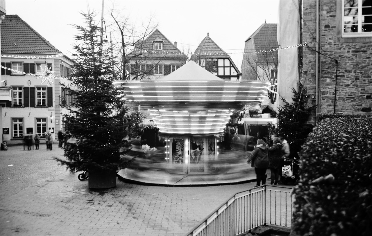
Last month I finally went out with a roll of Fomapan 100 to see if it’s working properly. And it is: No light leaks, most shutter speeds seem to be accurate, the aperture works, focus works, lens works. It’s not very nice at f/4.5, but much better at f/5.6 and from f/8 and above seems to render perfectly fine. Which I’m happy with.
I’m looking forward to trying this out on a proper hike, but for now, here are a few shots from that test-run:
As I start adding content to this blog more regularly, I thought I update – and I think improve – its design a little. Today I updated the headings and navigation links.
While I was previously using a single serif font for the whole site, I now introduced a second font for the mentioned elements: “Helvetica Neue Condensed Bold”.
I think this font is a good pairing to the serif body font. The upper-case Helvetica more clearly separates posts from one another and makes navigation links stand out more.
I often think a two-font serif/sans-serif pairing looks good and I’m glad I now found one that I like using fairly common fonts. I particularly like it because of the condensed variant (my thanks goes to zeldman.com for the inspiration).
Implementation
During implementation, I noticed it wasn’t very consistent to implement across Mac/iOS browsers, though.
Normally the following CSS should have been enough in my opinion:
For Safari and Firefox on a Mac, this is enough indeed and for iOS as well. But Chrome on the Mac wouldn’t show the condensed variant of the font. I had to add the condensed variant (its Postscript name to be precise) as a font-family:
This made Chrome (and Opera) show the same condensed version on a Mac as the other two browsers. For Safari however, this overwrites the "Helvetica Neue" + font-stretch statement again. But Firefox seems to ignore the additional font-family and still uses the font-stretch statement.
Anyhow, this works now and I thought I share this little CSS-inconsistency finding here.
In a future update I might look into having Android and Windows show a condensed font, but for now I’m fine with the fallbacks in this font stack.
Find the 35mm/full-frame equivalent to a focal length in different sensor- or film-format.
Between Christmas and New Year’s – or “between ze days” as we say in Germany – I worked on a little project: Focal Length Equivalents, a website that let’s you look up focal lengths of different film- or sensor-formats and find its equivalent to the 35mm/full-frame format.
Here’s some more explanation from that new site:
Like a lot of photographers, you might be familiar with focal lengths in the 35mm/full-frame image format and what field of view that focal length represents (24 mm = wide angle, 50 mm = “normal” etc.). Different formats, however, require different focal length lenses to produce an equivalent field of view.
With this site, you can look up these focal lengths and their 35mm-equivalents.
For example, when I bought my 6x9 camera, I wanted to know what its lens’ 110 mm equivalent field of view is in the 35mm format – because that’s the format I’m most familiar with. And when looking up information like this I always end up looking through some old forum threads, if I don’t want to calculate it myself (which I never did).
That’s why I built this little utility, which calculates it for me and saves me the search. Check it out!
The UI
The UI is a table that dynamically updates as you move a slider. That slider is an HTML input element of type range.
My idea was to create a super-simple interface that’s easy to use on both mobile and desktop – i.e. with a touch interface as well as a mouse/trackpad. There’s nothing to type into a field and no button to push to recalculate. Simply move the slider.
Another benefit of this is, that you are always comparing all formats at once. No need to select or otherwise “activate” a specific format. You simply look at the row of the format that interests you to compare (tip: you can tap/click on a row to highlight it for even easier visual comparison).
Drawbacks
A drawback of this UI is, that the slider is somewhat fiddly to operate. And it’s a not very precise UI element, either. I might be able to make it less fiddly by creating a custom design for the slider. But the imprecision will always be there I assume, especially on smaller screens where the input’s values are spread across less horizontal space. I limited the focal lengths you can compare to mitigate this issue at least a little – but this is yet another drawback itself.
This is the MVP
This version is a MVP – a Minimum Viable Product. There’s quite a few things I have in mind to improve the UI or better communicate each format’s dimensions (which are the base for the calculation), and also add more formats. But I think it’s already quite useful, and that’s why I’m making it public right now.
Here’s a quick tip for getting two rolls of 120 format film onto a single plastic development reel consitently and safely (i.e. wihout having the films overlap inside the tank):
Warm up the reel before winding on the films.
The reel should be dry to begin with. To warm it up, I simply put it out in the sun for a couple of minutes or use a hair dryer for a few seconds.
I’ve read this tip on a forum somewhere, and I haven’t had issues since I started following it.
Detailed instructions
When you have warmed up the reel, put everything in the darkbag (or darkroom) and start loading the first roll as you normally would.
Once you’ve ratcheted it on, use your fingers (as the ratcheting won’t work once the film is on completely) to keep winding it on until it hits the inner end of the reel. (Since I can’t handle the film on its side for this, I do touch the film directly.) Because the reel is dry and warm, this should work without resistance from the material. If you feel you have to force it, there’s a good chance you won’t get the film in completely. In this case, I would start from scratch or bite the bullet, and simply develop only one roll this time around.
Once the first roll is in, load the second roll as you did the first. Both ratcheting or simply pushing the film on do work in my experience. Make sure to not wind it in too far. There’s not much extra space on these reels, so stop winding as soon as the second one is on completely.
That’s it! Now you can start developing.
What I’m using
I am using a Kaiser Developing Tank with plastic reels for my film developing, which can hold two reels with one 35mm film each, or a single, expanded reel to hold medium format film. The only way to develop more than one 120 roll in a tank like this, is to spool two onto a single reel. And with it comes the risk of having the films overlap.
If you’re using a different tank system, this tip should also apply as long as the reels are plastic.
I tried loading more than one film several times before following this tip. It sometimes worked, and sometimes didn’t. Which meant I had films overlapping (quite substantially at times) and I lost quite a few negatives, because they came out undeveloped or only partially developed.
This one was on the verge of being lost.Most lost frames look much worse than this, where you can’t even figure out what was being photographed. And most frames I didn’t even scan.
Bonus tips for developing 120 film
Peel off half of the tape that holds each film roll together before placing it into the darkbag. This makes it easier to open the roll in the dark.
Always use enough developer (probably more than it says in the instructions for 120 film). Without a second reel to hold everything in place, there’s a good chance it’ll slide up a little during agitation, and will no longer be completely covered by the developer.
An example where I didn’t have enough developer in the tank. The shape of the undeveloped parts on the right comes from all the air bubbles that accumulate around the developer surface.
I just noticed Severin Koller has an updated homepage. There’s a bunch of photos I haven’t seen or forgot about. So I think I know what I’m going to do tonight.
He’s one of my favourite photographers and a major reason I’m shooting film. I especially like his street and documentary work, but his portraits are wonderful, too. And his other stuff as well. Go check it out!
If you like what you see, I encourage you to check out his blog, which is one of the best sites on the internet. Just wonderful – and more personal – street and documentary photographs. He’s got such a great eye for moments – from subtle gestures to more obvious juxtapositions – and an incredible skill to capture them. And you can basically follow his life for the last decade.
Eventually I will run this blog on different software and leave Tumblr. Tumblr is what powers this blog. It has served me well, and still is. But I am feeling increasingly discontent.
The main reason I feel this way is that I want to have more control over the technology that runs my blog/website. Although this is more work (but more fun!), I think it’s the only viable long-term solution. You never know, if Tumblr will still be around in a few years time. Plus I’ll have a better idea where my data is located and that it’s not directly fed into a third party system/social network.
Plus I dislike some things they do:
They won’t let me directly link to a different website. It’s always going through their redirecting service. It makes the browser status bar pretty much useless, plus I’d like to be the direct referrer to other sites.
I have the suspicion it promotes Tumblr to my visitors, although I turned that off.
It often shows a their privacy policy screen one has to accept when visiting pages on Tumblr. I don’t know if that’s the case for custom domains, too, but I think it is. That’s annoying.
I get regularly distracted by other people’s posts on my Tumblr Dashboard, when I only came here to post something. This is good and bad at the same time.
But these are comparably minor things. I simply want to be more in control and have something that I can comfortably run long-term.
If you want to set the current value of an HTML input element using JavaScript, use .value instead of .setAttribute to do so. Example:
//sets the current value
document.getElementById('FIELD-ID').value = 200
//sets the value attribute, i.e. the default value
document.getElementById('FIELD-ID').setAttribute('value', 200)
This makes sense now, but was something I was a little confused about recently. Of course, setAttribute sets the default value. Because that’s what the value attribute on an input is for. I meant to change the current value, though, but was trying to use setAttribute for that (which strangely enough worked for my purposes in Safari and Firefox, but not Chrome).
Anyhow, that’s my little reminder to self and my little piece of writing for the day.
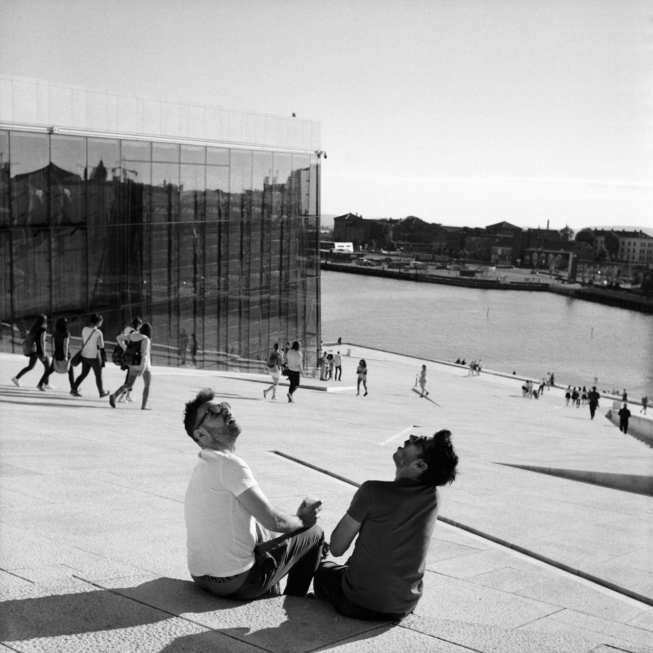
Patience and luck were responsible for getting this shot. I was standing at this very spot for approximately 1 to 2 minutes already, having the camera pointed this way, patiently looking down into it. I was waiting for some gesture or anything else interesting happening between those two. And then out of nowhere this helicopter flew over and they turned around – looking up – the way you see on the image. That they are pretty much look-alikes is just the cherry on top.
This was way better than I could have anticipated. I couldn’t quite believe it when I took the shot (and I only had one chance, as after advancing to the next frame, the scene was gone), and was thrilled when I finally got to see the negative after I developed the roll.
While out in the city today shopping with my daughter, I got unsolicited parenting advice. Apparently I was allowing something they would’ve never allowed. That person basically told me I’m a bad parent. I was flabbergasted. And offended.
What’s wrong with people? How rude can you be? I overheard one comment in the past, and also heard from friends complaining about similar experiences. This was the first time I got into an argument with someone. I have the suspicion it won’t be the last time.
I recently learned that it’s very practical to use a unit-less number to specify the CSS line-height. Unlike using a unit – like em, for example – this will make the line-height dependent on the text’s font-size, instead of being an absolute value.
Here’s a little example.
The markup (excerpt):
<body>
  Lorem ipsum dolor sit amet, consectetur adipiscing elit, sed do eiusmod tempor incididunt ut labore et dolore magna aliqua.

  <p>
    Lorem ipsum dolor sit amet, consectetur adipiscing elit, sed do eiusmod tempor incididunt ut labore et dolore magna aliqua.
  </p>

  <blockquote>
    Lorem ipsum dolor sit amet, consectetur adipiscing elit, sed do eiusmod tempor incididunt ut labore et dolore magna aliqua.
  </blockquote>
</body>
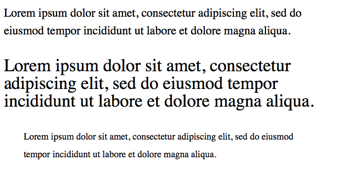
And here’s the CSS with unit, and the corresponding screenshot:
body {
  font-size: 1.5em; // 24px
  line-height: 1.5em; // 36px
}
p          { font-size: 1.5em; } // 36px, line-height still at 36px
blockquote { font-size: 0.8em; } // 19.2px, line-height still at 36px
Line spacing with em unit
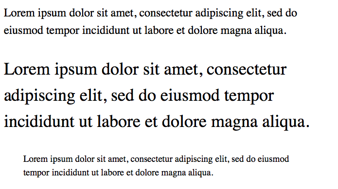
And here’s the CSS without unit. This looks far more balanced:
Using a unit-less number seems to be a better default, because the text generally looks better when its line height is based on its font size. I seem to need less line-height statements in total and the typography looks generally more appealing.
I simply love how film looks. Especially the black and white variety. Both as a digital file scanned from a negative and – especially – as a gelatin silver print (which I’m not remotely creating enough of).
Admittedly, I had to get used to the 35mm look, but now it’s hard for me to go back. The low(er) resolution and graininess are no longer bugs – they’re features1. Digital looks too clean to me. And while I can still enjoy and consume and be impressed by digital photographs, and while you can also simulate the film look in post, it’s not what I’m currently interested in for my own photography2.
Film has this aesthetic that’s more detached from reality. I don’t know how to best describe it. Film not only looks great to me, it also makes me feel differently.
You better look at them on a high-resolution screen or as a print, though. ↩︎
What feels a bit silly is, that I even try to avoid shooting digitally, because whenever I take a good digital photo, I wish I had shot it on film. ↩︎
The Internet privacy company that empowers you to seamlessly take control of your personal information online, without any tradeoffs.
For years now, I’ve been using DuckDuckGo as my search engine.
In 98% of the cases, it gets me what I’m searching for1. Unlike Google, it respects your privacy: they don’t track you!
DuckDuckGo is easily setup as your default search engine in every popular browser – both on desktop or mobile computers/phones. I use it on all my devices and I don’t want to go back.
In the 2% it doesn’t, I still resort back to Google, though. :-( ↩︎
Do Not Look Down
I can’t get enough of Meshuggah at the moment. And in particular this song. Such a mean groove!
In good Meshuggah fashion, it’s polymetered:
The first riff for example is in 17/8 (that’s how I count it anyway), and both guitars/bass and drums play it like this initially. But after the first 8 bars (around the 26 second mark, after 2 rounds of that riff), the drummer’s hands start playing 4/4 time while his feet and the guitars stay in 17/8. From then on, the drumming stays that way. Which means you can easily nod your head all the way through, even though that might not be immediately obvious.
There’s a lot more going on throughout the whole song (which I haven’t completely analysed like this), and it’s so fun to listen to that I keep coming back over and over again.
For one-column responsive layouts – like this blog for example – I like using width-based font sizes. Using the vw (view width) unit, the font size automatically scales based on the width of the viewport. It’s perfectly responsive without the need for media query breakpoints (at least initially, see below).
Here’s what I found to be a good calculation:
body {
  // 1em minimum font size (usually 16px) plus
  // 0.7% of the browser window’s total width
  font-size: calc(1em + 0.7vw);
}
This however stops working as intended, once the viewport starts becoming wider than the container the text resides in. It’s very common (for me anyway) to specify a maximum width of the main element that holds the text. But vw takes into account the width of the whole browser window, which inappropriately keeps increasing the font size, while the container width remains at the maximum width specified.
For example, this blog currently specifies a max-width of 700 pixels for its main content. So, I’d like to calculate font size based on the container width of 700px instead of the whole browser window width:
However, since the calculation is static, I ended up simply calculating it myself in ems and use that:
@media (min-width: 701px) {
  body {
    font-size: 1.306em;
  }
}
Can’t we just get max-font-size?
A note on CSS variables
While deciding on these statements above, I also tried out CSS variables to store certain values like the max-width of the container etc. to calculate the font-size like so:
need a breakpoint anyway to either redefine a variable or the calculation and
I’d need additional fallback statements for browsers that don’t understand CSS vars.
So, I decided against using them. For a more complex project, this might be a different story, but for a simple site with a pretty static design, that’d be total overkill and backwards in my opinion.