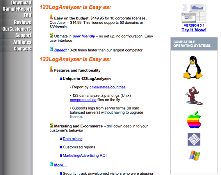
Flashback!
Flashback!
“CSS3 is where things are headed, and portions of it are here now. It’s not all or nothing, either. Sprinkle CSS3 in. Don’t tell your boss or client. Have fun with it, prototype with it, embrace it. Don’t be afraid to start using CSS3 right now.”–
Dan Cederholm, Up Late with CSS3, and Loving It! (via webkitbits)
All in all an informative article with opinions on web-standards, CSS, web browsers and more.
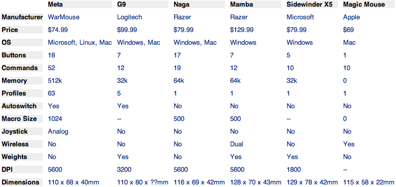
More on the OpenOffice Mouse:
This chart shows you just how much the WarMouse Meta (formerly the OpenOffice Mouse) is better than other mice, including Apple’s Magic Mouse (which, to be fair, actually has zero buttons).
Dear entire industry: forget bullet lists and learn storytelling.
The extended take is, “an uninterrupted shot in a film which lasts much longer than the conventional editing pace either of the film itself or of films in general, usually lasting several minutes. It can be used for dramatic and narrative effect if done properly, and in moving shots is often accomplished through the use of a dolly or stedicam.”
The extended take is a cinematic hire-wire act that pushes the director, actors, cinematographer, art department, sound design, and every other department to their limits. They take a very long time to set-up, and are very easy to mess up. The longer the take, the more pressure is added to get it right.
Now I’m a little smarter and saw some truly amazing film scenes.
(via kottke)
At The Gates - “Slaughter Of The Soul” (Live, 2008)
Damn. Not bad for old guys.
It is not certain what band originally started the Gothenburg sound, however, it is widely accepted that Dark Tranquillity, At the Gates, and In Flames are three major pioneers of the style; however history yields that At the Gates began playing a much more contemplative and “Neoclassical” style of death metal in their early years, very comparable to the Finnish act Demilich. It wasn’t until their later albums (Slaughter of the Soul being the most commercially known) when the Gothenburg sound was recaptured.
“I’d be thrilled if the iPad edition of Instapaper sold one-tenth as many copies as the iPhone edition, and I think that’s optimistic. Would you put in another 50-100% of development time to increase sales by 10%? (I’m going to, but that’s because I’m that kind of guy. I just spent months hacking the Kindle edition of Instapaper that’s used by almost nobody and makes almost no money, simply because I wanted to use it myself and I wanted it to be awesome.)”–
Marco.org - Loosely organized initial thoughts on the iPad
Great attitude! I think this is what makes great software.
“The market for potential iPad users is tremendous, possibly larger than the iPhone’s market. There are millions of PC users who are dissatisfied with their virus-ridden, clunky computers who just want it to work better for the simple things they do every day. … For $500 less [than a MacBook] they can own a piece of Apple technology that lets them do almost everything they currently do in a form-factor that’s more convenient, mobile and beautiful. This is the iPad’s intended audience.”– Mike Rundle hits the nail on the head. (via nikf)
“Too much complexity is for people who want to waste their own time. Who has time for that? Every day means a new world we have to create. Futzing and configuring and confusion — these things don’t help.”– Brent Simmons in Bad Gravity
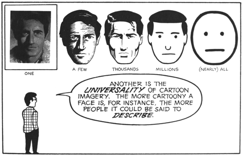
Interesting, isn’t it? ignore the code: Realism in UI Design
Support all browsers to some degree – focus first on the latest and greatest browsers, and then go back and make sure that older browsers look and work reasonably well.
This reflects precisely my approach to creating a website/webapp. I love the new features of CSS3 so much, because they enable me - as a developer - to create a decent UI without having to mess around in Photoshop or write tedious, non-semantic markup just to create good looking buttons, rounded corners etc. The design is implemented quicker, is flexible and the site loads faster, too.
The idea here is to begin with a nice, well-styled presentation that looks good in even archaic browsers like IE6. This is a good thing because even visitors using crappy browsers will be able to read and interact with your content. But instead of stopping there, progressive enhancement says, “let’s provide some additional features for people using better browsers.” After all, people using awesome browsers like Firefox, Safari, and Opera want the best experience possible from the Web. Progressive enhancement says, “let’s give it to them, but only after the less-capable crowd has been taken care of first.”
Unfortunately, when you have a lot of IE users and want to present your site in the best possible way, you have to bite the bullet and create all those buttons and rounded corners in Photoshop.
But I think the ‘progressive enhancement’ method is the best thing you can do. You can offer the best possible visual experience for those who use the latest and most advanced browsers at relative low costs. And for those who use older browsers - well, they probably do not care that much about having the best possible experience on the web anyway.
Altogether, the article is a good read and also provides practical information on the new CSS3 techniques - some of which you might not have heard of yet.
“Restraint is hard. Complication and elaboration are easy…and are common.”– Presentation Zen: Gates, Jobs, & the Zen aesthetic
“It always takes longer than you expect; even when you take into account Hofstadter’s Law.”– [Douglas] Hofstadter’s Law. That is what I am really experiencing right now! (via merlin)
“It is your responsibility as a professional developer to properly document software that is intended for use by others. Managing software complexity is a hugely important part of keeping a project efficient, and that’s hard to do if nobody knows how to use your software, or what methods are safe to call.”– Tom Preston-Werner in Semantic Versioning
![Turning Torso (Malmö, Sweden) : Travellerspoint Travel Photography (Architect: Santiago Calatrava)
“ The tower’s design is based on a sculpture by Calatrava called Twisting Torso.[1] It uses nine segments of five-story pentagons that twist as it...](../../.././64.media.tumblr.com/tumblr_kwbacgUudA1qa3r7do1_540.jpg)
Turning Torso (Malmö, Sweden) : Travellerspoint Travel Photography (Architect: Santiago Calatrava)
The tower’s design is based on a sculpture by Calatrava called Twisting Torso.[1] It uses nine segments of five-story pentagons that twist as it rises; the topmost segment is twisted ninety degrees clockwise with respect to the ground floor. Each floor consists of an irregular pentagonal shape rotating around the vertical core, which is supported by an exterior steel framework.
How great is that? I am impressed!
“User experience is everything. It always has been, but it’s still undervalued and under-invested in. If you don’t know user-centered design, study it. Hire people who know it. Obsess over it. Live and breathe it. Get your whole company on board. Better to iterate a hundred times to get the right feature right than to add a hundred more. The point of Ajax is that it can make a site more responsive, not that it’s sexy. Tags can make things easier to find and classify, but maybe not in your application. The point of an API is so developers can add value for users, not to impress the geeks.”– Evan Williams | evhead: Ten Rules for Web Startups